Accessible colour palettes: the complete guide
Why colour accessibility is crucial
Colour is one of the most widely used tools in web design: it attracts attention, signals action, prioritizes information, and conveys emotion. But relying solely on colour can create significant obstacles for some users.
- People with colour blindness: approximately 8% of men and 0.5% of women are affected by some form of colour blindness. For them, certain combinations (such as red/green and blue/purple) become indistinguishable.
- Visually impaired people: poor contrast perception makes reading difficult, especially if the text is light on a light background or dark on a dark background.
- Mobile users: high brightness on a screen can reduce colour readability, even for people without visual impairments.
- Elderly people: sensitivity to contrast decreases with age, making reading on screen even more difficult.
Ensuring good colour accessibility is not just about complying with the law. More importantly, it is about enabling everyone to use and understand content without ambiguity.
This is why the WCAG imposes two major rules:
Criterion 1.4.1 “Use of colour”: colour should never be the only means of conveying information.
Criteria 1.4.3 and 1.4.11 “Contrast”: there must be sufficient contrast between the text and its background.
The RGAA incorporates these obligations in its criteria 3.1, 3.2, and 3.3.
Best practices to follow
1. Never convey information solely through colour
Let’s take a typical example: a form where required fields are marked in red. For someone who is colour blind, this difference may be imperceptible.
<label for=”email”>Email (required)</label>
<input type=”text” id=”email” aria-required=“true”>
Here, the word “required” is written in full, and the aria-required=“true” attribute allows assistive technologies to announce the information correctly.
Other common cases to correct:
- Links differentiated only by colour: it is advisable to add underlining or an additional visual effect.
- Colour-coded tables: provide a text legend, or use distinctive patterns/shapes.
- Active state or error of a button: combine colour with a pictogram or text message.
2. Ensure sufficient contrast for text
The WCAG (criterion 1.4.3) imposes minimum contrast ratios:
- Normal text (< 24px or 18,5px bold): 4.5:1.
- Large text (≥ 24px or 18,5px bold): 3:1.
These ratios ensure that text remains legible for the majority of users, including those with low vision.
Correct example: black text (#000000) on a white background (#FFFFFF) → contrast 21:1.
Incorrect example: light gray text (#999999) on a white background (#FFFFFF) → contrast 2.5:1.
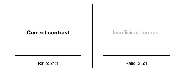
Tools such as WebAIM’s Contrast Checker or the “Colour Contrast Analyzer” extension allow you to test combinations quickly.
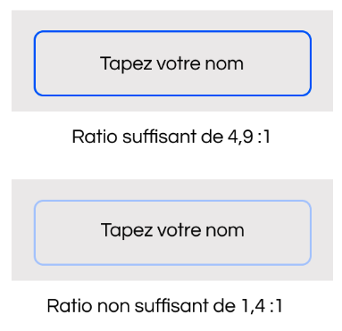
3. Ensure sufficient contrast for interactive elements
Interactive elements, such as buttons, form fields, or interactive pictograms, must also have sufficient contrast with their background.
WCAG and RGAA require a contrast of at least 3:1 between the interactive element and its background.
See the example below, which features a blue-outlined form field on a grey background. The top one has sufficient contrast, with the blue colour (#0051FF) on the gray background (#EDEBEB). The bottom one is insufficient, as the blue (#AEC7FF) is too light compared to the grey background.
4. Check the accessibility of interactive states
Links and buttons must remain identifiable at all stages: normal state, hover, keyboard focus, and click (active). Other visual cues, such as underlining or border thickness, must reinforce colour changes. The contrast of these interactive elements must meet a minimum ratio of 3:1, regardless of their state.
5. Ensure readability in different display modes
- High contrast mode (Windows, Linux, browser extensions)
- Dark mode or custom themes (dark mode/high contrast custom)
- User colour customization
- Avoid using background images or gradients to convey essential information.
- Check that icons and buttons remain visible when the background changes (use borders, symbols, or high contrast).
- Ensure that the interface remains functional even when the system contrast is enabled. For example, test the page with Windows high contrast mode.
- Use CSS media queries (prefers-contrast, prefers-colour-scheme) to offer a version adapted for dark mode or high contrast. Example:
Common mistakes
- Using colour alone to indicate an error in a form.
- Choosing “trendy” palettes without checking the contrasts. Styles change, but the constraints remain the same.
- Forgetting to test icons and pictograms: a yellow icon on a white background may be invisible to many users.
- Removing underlining from links without adding another visual indicator.
Colours and contrasts are essential elements of digital accessibility. They ensure that content remains readable and understandable, regardless of the user’s visual impairment, lighting environment, or age.
To design an accessible website or application, there are three simple principles to remember: never rely solely on colour, ensure sufficient contrast for all text and interactive elements, and test interfaces in different display contexts.
Doing this work upfront prevents many problems and provides all users with a clear, enjoyable, and equitable browsing experience.
Book
a discovery call
Assess the extent of your digital accessibility, development, or branding needs
Get concrete ideas for areas of improvement
Benefit from our expert advice, in-depth experience, and strategic vision in the field
Free • 45 minutes • Online